Customers InComplete Checkout
This Is What Your Customers are Thinking When They Don’t Complete Checkout
Here’s a frustrating fact about online shopping carts:
You can expect 2 in 3 shopping carts to be abandoned. (source)
This is a harsh reality check for anyone running an ecommerce store. You worked so hard just to get the customer to your site. You worked even harder to move them through your online store and to purchase something. And now that they’re in the checkout line, they mysteriously leave, even though their basket is full of items.
What’s happening here?
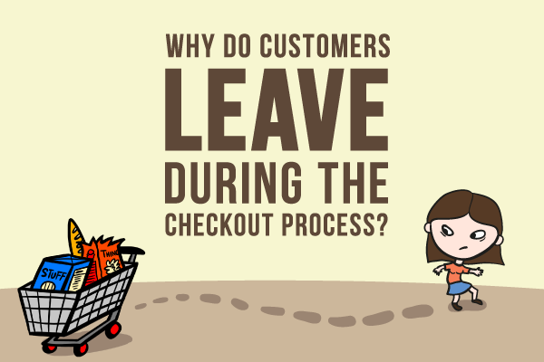
Why do customers leave during checkout?
The main thing to realize is that in many ways, online shopping mirrors offline shopping. For instance, there have been times when I go grocery shopping, put some items in my basket, but for some reason, decide not to buy. That’s normal shopping cart abandonment. You can’t avoid that. Accept that your abandonment rate will never be 0%.
What’s not normal is me loading up my cart, going to the checkout line, and as I’m about to hand over my credit card to the cashier, I suddenly decide not to buy anything and just leave. This is not normal, and this is the type of shopping cart abandonment we’re going to focus on fixing in this post.
To do that, let’s step in the mind of the buyer.
Here’s 5 things that your customers are thinking when they load up their shopping cart but decide not to buy anything:
“How long is this going to take? Ugh, forget it.”
THE PROBLEM: too many steps needed to check out
THE SOLUTION: ruthlessly minimize the information you need. (you can always collect the information post-purchase)
Imagine you lined up at a grocery store with a full shopping cart, but before the cashier swipes your card, she hands you a clipboard with a form that you have to fill out. A few questions is no problem. An immigration form is a big problem.
“It’s going to take me 3 weeks to get this thing? Ugh, forget it.”
THE PROBLEM: shipping options poorly communicated
THE SOLUTION: be upfront about your shipping times, and go out of your way to be transparent especially during peak holiday periods.
Set your customer’s expectation properly. Say you’re back at the grocery store and the cashier is about to swipe your card, but before she does, she tells you that you won’t have your groceries until next week. How would you feel? If there had been signage in the grocery store, your expectation would’ve been set and there would be no surprises during the payment process. Not showing shipping rates is just one of the many ecommerce mistakes to avoid.
“You want me to check my email before I buy something? Ugh, forget it”
THE PROBLEM: requiring email-verified accounts before accepting payment
THE SOLUTION: having payment processes for guests & returning users
So I’ve got a full shopping cart at the grocery store. I’m about to hand my credit card to the cashier. But before she takes it, she tells me that I have to go home and open a letter to confirm that I’m buying something from the store.
Email inboxes are full of distractions: don’t send your customers there while you have them in the grips of the buying process. Don’t force them to make an account just to buy something. While waiting for that email to arrive, anything could arrive that takes their attention away from you: newsletters, emails from family…or promotions from competitors.
“There’s a form for a coupon…now I feel stupid for paying full price. Ugh, forget it.”
THE PROBLEM: coupon fields that make the buyer price-sensitive
THE SOLUTION: de-emphasizing the coupon code field on payment screen
The shareable nature of online coupon codes makes this an egregious mistake. Offline, if a grocery store cashier asks you if you have a coupon or discount card, and you don’t happen to have one, you’re still happy to proceed as normal.
However, with online coupon codes, it’s more like this: the grocery store asks you if you have a coupon or discount card, and you don’t happen to have any. She then goes to tell you not to worry, because you can take your time to call your friends to see if they have any coupons they can share. She’s implying that you can save money if you just take some time to look.
Not only are you distracting the buyer from the purchase process, you’re making them feel like a sucker while asking them to pay.
“I have to pay extra just to use my Mastercard? Ugh, forget it.”
THE PROBLEM: having restrictive payment options
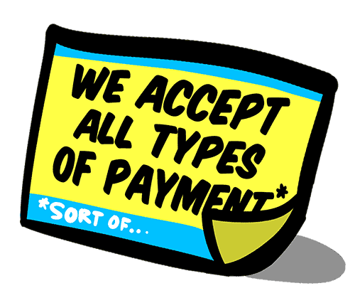
THE SOLUTION: accept multiple forms of payment (and be transparent about the ones you don’t accept)
Imagine you’re at the checkout line at the grocery store. When it’s your turn to pay, you’re told that you can’t pay with your credit card, and you can’t use cash or cheque. (or, you’re told that you can use your credit card, but only if you pay an additional fee.)
If you’re like most people, you’ll feel something along ranging from mild annoyance to active hostility toward the grocery store. This is no way to treat customers who are ready and willing to give you money, and could have easily been avoided had the grocery store been more upfront about the types of payment they accept.
Conclusion: make checkout painless, keep them coming back
If you’re suffering from high shopping cart abandonment rates, the first thing to do is perform an honest audit of your checkout process.
Bring in a pair of fresh eyes and look over their shoulder as they make a mock purchase on your store. With healthier checkout completion metrics, you’ll have the time and resources to focus your attention on things that keep your buyers coming back for more.
Reduce obstacles, particularly points of frustration and distraction — the ideal checkout processes are fast and frictionless.


