Flat Design Is Not A Trend, It’s Been Around For Some Time
Flat Design Is Not A Trend, It’s Been Around For Some Time
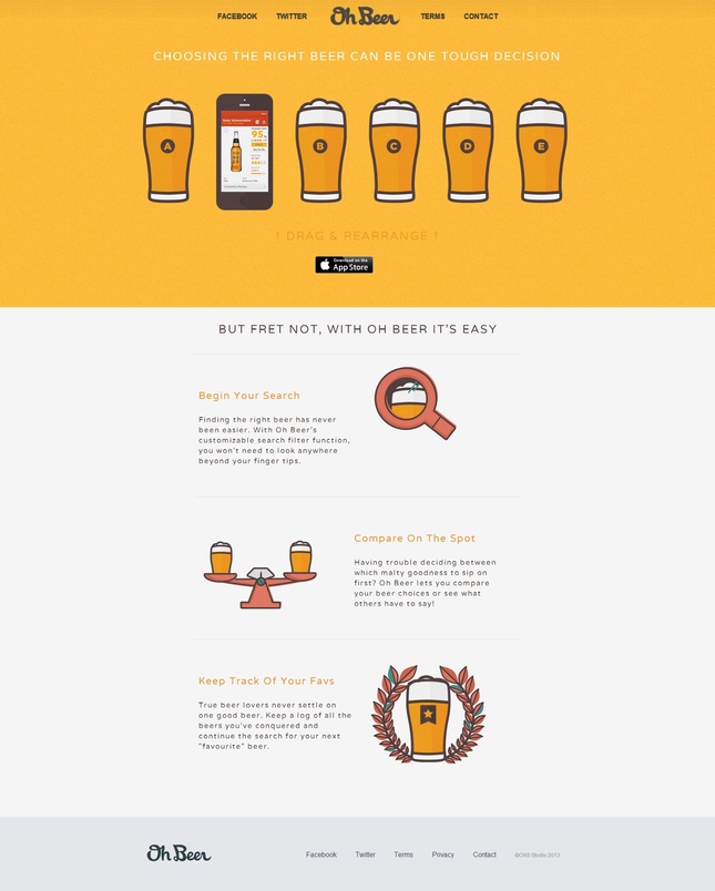
Flat design has probably been the most common thing heard by designers this year due to the hype created around it and with the promotion, or rather said, indoctrination done by the design community, almost all of us thought that this is actually a trend.
I shamefully admit that I was one of those people who thought/believed that flat design is a trend, a recent style that we adopted. In fact, flat design has been with us since the early years of printmaking through the Swiss style.
It is true that we adopted it on a large scale really fast, but that’s only because there was a high demand created by the advancements in technology and the need to display more information. It is easier to display information in a rather minimalist style, within a clean interface that is displayed well on various mediums and platforms, thus the usage of flat design has become popular.
Using Flat Design
It is known that most designers have a thing for minimalism, but minimalism has its limits and constraints. Flat design is somehow related to minimalism in terms of ideology and usability, having crispness and clarity by keeping the minimal look, but handling more complexity.
A big reason why it is used so much among web designers is the fact that it can be easily used for responsive websites to fit seamlessly in any screen size. The other big reason that is also related to the latter is that by using flat design you can make websites faster and more functional.
If you have a website that handles a lot of traffic, using flat design is the thing you need to reduce the server load. Also, consider that many people don’t have top notch internet connections and you need to design for the average visitor, making the website files as small as possible. Having a page with lots of graphical elements that loads in a few minutes will surely make your visitors avoid your site.
Read more on : http://dezayo.us


